The Language of Product Design - Typography
This is part of the Language of Product Design series. You can find the other posts at the end of this one.
Font
One single variation of a typeface e.g. Helvetica Bold
Typeface
A group of all variations of a font e.g Helvetica Bold, Helvetica italic, Helvetica Regular, Helvetica Bold Italic
Baseline
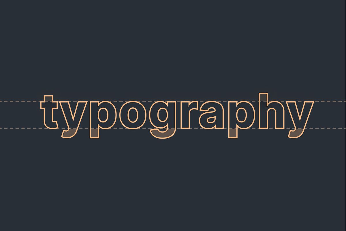
The baseline is the invisible line that the letters sit on. All flat bottom letters will sit exactly on the baseline, whilst curved letters such as c, s, p will sit slightly below to account for their curved structures.
Ascender
An ascender is the top-most part of a letter that extends above the x-height of the font. Letters which have these include b, d.
Descender
A descender is the bottom-most part of a letter that extends below the baseline of the font. Letters which have these include p and q.
X-height
The height of the lowercase ‘x’ in the font. This usually marks the height of all lowercase letters that don’t have ascenders of descenders. a, c, e etc. It’s measured from the baseline to the top of the lowercase letters.
Ligature
Some fonts include ligatures. These are letter combinations designed to include all letters in one glyph. Common ligatures can be found combining f and i or s and t.
Serif
A category of typeface that has marks or strokes at the end of characters.
Sans-Serif
A category of typeface that doesn’t include serifs (sans means ‘without’ in French). Usually sans-serif character strokes are single width.
Monospace
A category of font where each character takes up the same width. These are typically used in code editors, or to denote code
Slab Serif
A category of typeface that mixes characteristics of both serif and sans serif typefaces. The letters in the typeface usually have a single width stroke like sans-serifs, and have serifs which are generally the same width as those of the typeface.
Kerning
Adjusting the spacing between individual letters is called kerning. A typeface will come with kerning set for its characters and character pairs. e.g VA TT
Leading / line-height
Leading or line-height is the distance between lines of text in a paragraph. The word ‘leading’ comes from the print industry when lead was placed between lines of letters to create space..
Tracking
Tracking is similar to kerning, but it is a global amount of space between characters for an entire group of text.
Widows and orphans
A widow is a word that is the last in a paragraph and appears on its own at the start of a new page.
An orphan is a word which sits on its own on a new line. Removing orphans improves readability of text for users.
Read more in the fundamentals series
